Neil Webb | CONCEPTUAL ILLUSTRATION
Images for editorial, advertising and publishing
Process
Strong concepts and visual metaphor are the cornerstone of what I try to do. To start, I begin combing the text/brief, and begin brainstorming to find strong visual cues and associations. Once I have a few ideas, I sketch a more solid (still rough) pencil composition to present to the client. This serves to present the concept and a give good idea of the composition. Once the final concept is chosen I work up the final image digitally, with provision to make any changes, also taking in to account any requirements like brand colours etc. I’m always happy to adapt this stage, if the client prefers to see a work in progress in between.
Below are a few examples of sketched concepts and finished illustrations. The first example includes a video of my creative process.
‘Hero’ image for the Alnuctamab Vision Workshop
I was commissioned by Fingerpaint to produce an image celebrating the development of a synthetic antibody used in the cancer drug Alnuctamab. The brief centred on a new journey of hope with this medication. The chosen concept shows an older couple hiking out of a valley, formed by the shape of the antibody, into a new dawn. Below is a time lapse video of creating the image.
Concept sketches
Cover for Practical Law Company magazine
The brief was about how competition law is confronting companies who hoard data. The chosen idea was this hoarding dragon that also forms a brain, confronted by a heroic lawyer.
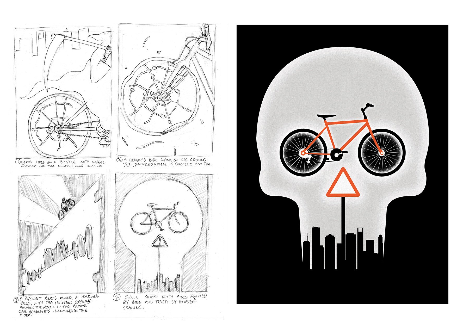
Houstonia Magazine
For a feature on the dangers of cycling in the city of Houston
Texas Highways magazine
For an article by a writer who moves to the desert and is inspired by it’s alien beauty, strange plant life, unexpected brooding weather and uncanny feeling of being on another planet.
Royal Mail Agatha Christie stamps
This project was a collaboration with Studio Sutherland. A set of stamps for Royal Mail, each being based on a pivotal point of a different Agatha Christie novel. In the spirit of crime fiction and detective work, as well as using conceptual twists in the imagery, the six stamps contain hidden secrets in the form of microtext, UV ink and thermochromic ink.
I'm thrilled to say that the stamps have also gone on to win a yellow pencil at the D&AD awards, a best in book prize for the Creative Review Annual and a merit in the 3x3 annual.
Below is one of the stamps with concept sketches - ‘The Body in the Library’ . Please view the full set here


